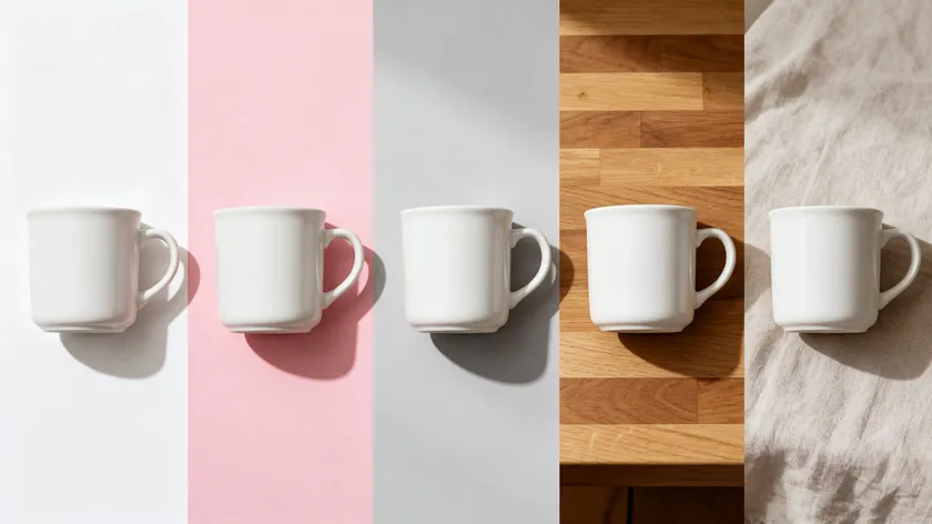
Most product photography examples you see online look polished for one reason: the background does the heavy lifting. Swap a cluttered kitchen counter for a clean white surface and the same product photograph instantly goes from amateur to marketplace-ready. Swap again to a lifestyle scene and you have a social media hero shot.
This article walks through five core background styles—pure white, transparent PNG, brand color, natural shadow, and lifestyle scene—with copyable product photography ideas organized by product category and platform. Every idea focuses on what sits behind the product, not camera settings or light source tutorials.
You can recreate each example from a single photo with RemoveBackground.app. Upload once, instantly change the background, and export for Amazon, Shopify, Instagram, or email. All products shown are illustrative examples.
Table of Contents
Before-and-After Background Examples
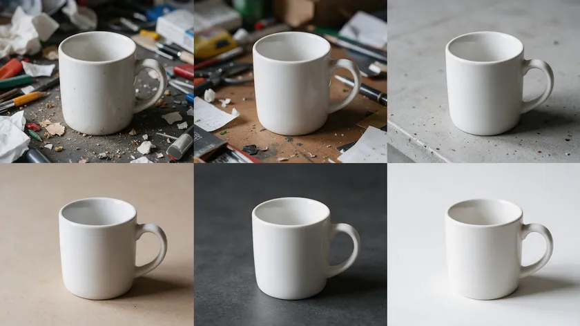
The fastest upgrade to any product image is a background swap. You keep the same shot, the same angle, the same detail—and simply change what surrounds the product. The final image looks like it came from a different shoot entirely.
Each example below compares a “before” image (busy or dull background) with an “after” optimized for a specific ecommerce use case: an Amazon listing, a Shopify product page, an Instagram Reel cover, a holiday email banner, or a Pinterest pin.
A seamless background removes distractions and highlights products, so the product stays the hero in every version.
The next five sections break down each background style using a concrete product example.
Pure White Background Before-and-After
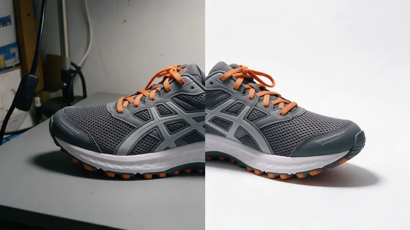
A seamless white background is standard for ecommerce photos. Amazon’s main image guidelines ask for a pure white background (RGB 255, 255, 255) on main listing images, and marketplaces like Walmart and eBay also steer sellers toward white or plain backgrounds.
Before: A men’s running shoe photographed on a gray tabletop with visible wall clutter, uneven shadows, and a lamp cord creeping into the frame. The shoe gets lost.
After: The same shoe cut out and placed on pure white with a subtle contact shadow under the sole. It sits centered with generous negative space on all sides, ready for mobile screens. Minimalist product photography removes distractions to highlight the product, and this style simplifies post-production by reducing shadows to a single grounding element.
Where to use it: Amazon main product image, Google Shopping ads, comparison tables on review blogs, and any product pages where clarity matters most.
For exact marketplace rules, see the white background for selling items guide and eBay specifics in the best background for eBay photos.
Transparent PNG Background Before-and-After
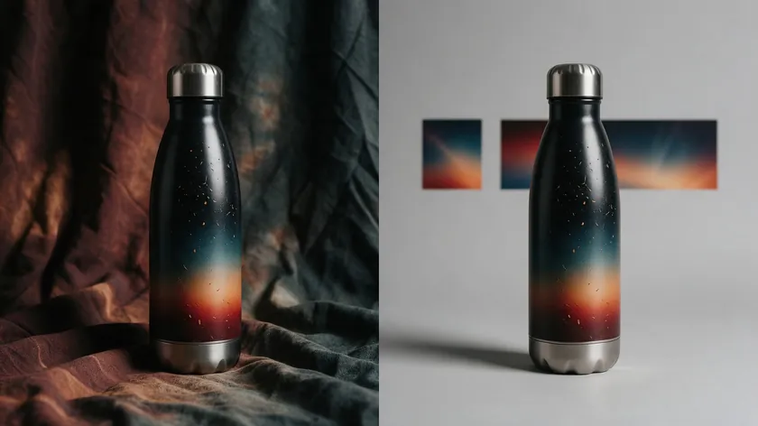
A transparent PNG strips the background completely, leaving an isolated product that designers can drop onto any color, pattern, or campaign template without losing quality.
Before: A stainless steel insulated water bottle photographed on a wrinkled fabric backdrop. The creases compete with the bottle’s clean lines.
After: The same bottle exported as a transparent PNG—no background at all. Marketing teams overlay it on a gradient hero banner, a dark-themed email, and a seasonal holiday background, each version looking intentional. Minimalist photography can enhance product appeal by focusing on shape and color alone, which is exactly what a transparent export achieves.
Where it shines: Shopify hero sections, pitch decks, A/B testing different website banners without reshooting, and multi-language email templates where the surrounding design changes but the product stays constant.
For file format details, see how to save an image with a transparent background.
Brand Color Background Before-and-After
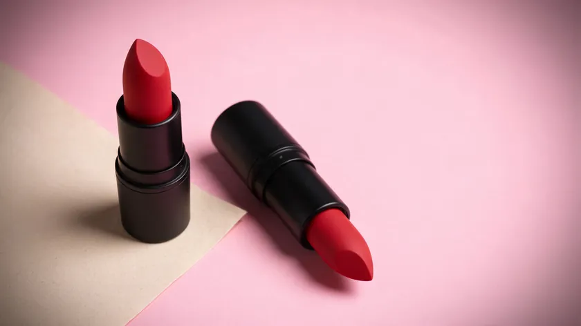
Replacing a neutral backdrop with a brand color immediately boosts recognition in crowded feeds and ads. Color-themed photography uses colors to establish brand identity, turning a plain background into a branding asset.
Before: A matte red lipstick shot on beige seamless paper—bland, low contrast, forgettable in a social feed.
After: The lipstick cut out and placed on the brand’s signature soft pink (#F9C4D5) background with a gentle vignette and negative space left for ad copy. The product pops. The color screams “this brand.”
Channels: Meta ads, TikTok ad covers, homepage banners, and packaging mockups where a brand color ties the campaign together. A gradient or color overlay can echo the brand palette in supporting assets while the main product stays clean and color-accurate.
Colored gels on the lights can echo the same palette during a shoot, but a background swap gives you the color with full control.
A plain background doesn’t have to be white. It can be any single, intentional color that suits the brand.
Natural Shadow Background Before-and-After
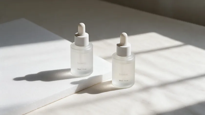
Natural shadows keep the product grounded so it doesn’t look like a sticker floating in space.
Before: A 30 ml frosted glass skincare serum bottle shot on a flat surface of white foam board with a harsh, unrealistic drop shadow added in editing. It looks cheap.
After: The bottle cut out and placed on a soft off-white background with a realistic natural shadow that mimics window light. A realistic shadow like this makes even a studio shot feel warm and real.
If the product sits on a reflective surface such as glass or acrylic, a faint reflection under it adds depth without adding clutter.
Key uses: DTC product pages, carousel images on Instagram, and Pinterest where subtle depth feels more premium than a flat white cut-out. Position the product slightly off-center to leave room for micro-copy or price badges.
For clean cut-outs and shadow control, see remove background from product photography.
Lifestyle Scene Background Before-and-After
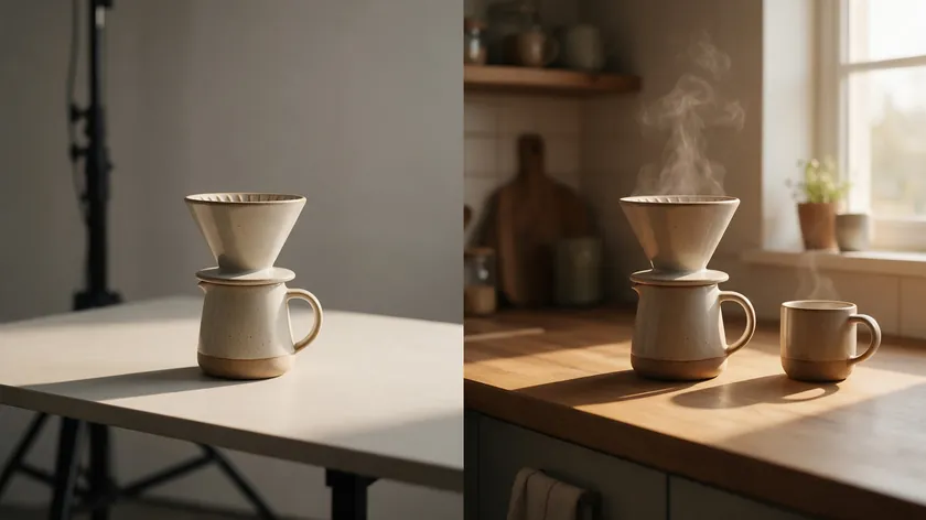
Lifestyle shots use context—not just color—to tell a story around the product. Creative product photography evokes emotion and communicates utility, and a well-chosen scene does both in a single frame.
Before: A ceramic pour-over coffee dripper photographed on an empty studio table as a plain packshot. It’s accurate but lifeless.
After: The same dripper composited into a cozy kitchen scene—wooden counter, morning natural light, steam rising from a coffee mug, an open newspaper—yet the dripper still clearly remains the hero. Natural backgrounds can add context and meaning to product images, and lifestyle shots show products in real-world scenarios to enhance relatability.
Natural light from a window and the warm tones of golden hour make these scenes feel inviting, so choose a scene background with that same soft glow.
Use these scenes for social posts, blog headers, Amazon A+ content modules, and homepage lifestyle bands where emotion and environment drive clicks.
Examples by Product Category
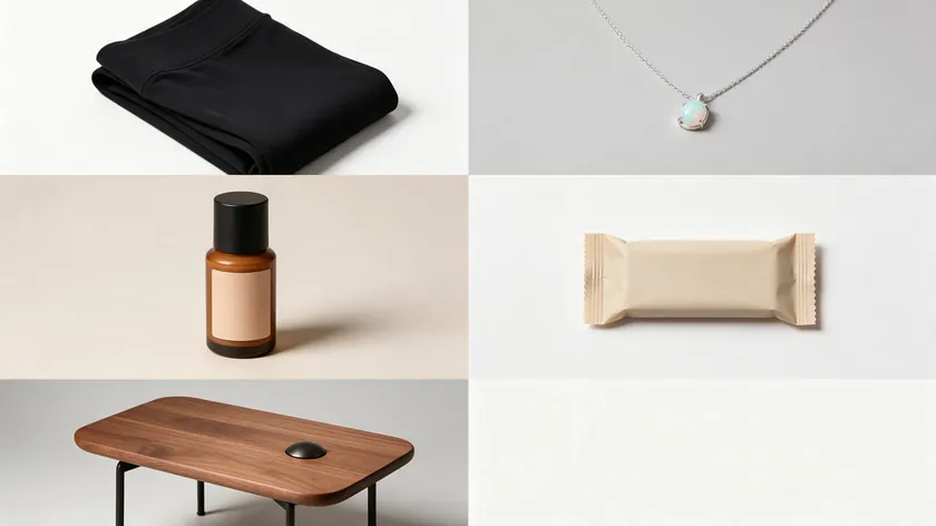
This section shows concrete product photography examples for five key ecommerce niches. The focus stays on backgrounds and scenes—not lighting tutorials or camera settings. For shooting fundamentals and tips on reflective surface products, see the ecommerce product photography guide.
Textured backgrounds can enhance product features and appeal when matched to the right category, so each subsection includes two to three background variations you can copy.
Clothing Product Photography Examples
Product: Women’s high-waisted black leggings sold on a Shopify fitness apparel site.
Example 1—Pure white, product page: Front and back shots on white with a clean, centered frame and large negative space for mobile screens. This version is ideal for the main gallery.
Example 2—Lifestyle scene, homepage hero: A lifestyle scene on a running trail background that shows movement, fabric stretch, and fit. A lower angle hero shot suits this scene because it makes the leggings feel dynamic, and these frames are perfect for homepage hero shots and social ads.
Example 3—Flat lay, email and Pinterest: Flat lay photography captures products from directly above for a 2D effect. Arrange the leggings on a light wood floor with a sports bra, smartwatch, and earbuds—ideal for email headers and Pinterest pins.
Jewelry Product Photography Examples
Product: A sterling silver pendant necklace with a small opal stone.
Example 1—Close-up crop on pure white: The opal stays centered with a delicate natural shadow, isolated for zooming on details. A macro lens close-up, or a tight crop of a standard photo, lets potential customers inspect the stone and the metalwork before they buy.
Example 2—Soft brand-color backdrop (muted blush): The necklace displayed on a linen bust, set against a muted blush background for premium ecommerce product pages. The soft blush tone makes the silver and opal stand out without the starkness of pure white.
Example 3—Lifestyle on a book and linen bedsheet: The necklace resting on a closed book and linen bedsheet creates a quiet, giftable mood, great for Instagram Stories covers and gift-guide blog posts.
For how to shoot reflective products, see the ecommerce product photography guide.
Cosmetics Product Photography Examples
Product: A liquid foundation in a frosted glass bottle with pump.
Example 1—White background hero shots: Use these hero shots for ecommerce catalogs and retailer submissions, including a straight-on front shot and a second view for the product page gallery. A clean white background keeps the focus on the bottle and pump, which is exactly the look beauty brands want for comparison pages.
Example 2—Brand-color gradient (peach to coral): Use it for campaign landing pages and paid social. A soft gradient keeps the look airy and makes the product feel aspirational.
Example 3—Lifestyle bathroom-counter scene: Marble vanity, soft natural light, folded towel—showing the product in a real morning routine context. A top-down flat lay with a few product ingredients and swatches makes a good secondary lifestyle shot.
Background choices differ between high-clarity comparison pages (white) and mood-driven campaign assets (brand color or lifestyle). The idea is to match the frame to the viewer’s attention at each stage of the funnel.
Food and Beverage Product Photography Examples
Product: A protein snack bar and a canned cold brew coffee sold as a breakfast bundle.
Example 1—Flat lay on white: Both items with minimal props—a spoon, some oats, scattered coffee beans—on a flat surface. Ideal for product detail pages and Amazon bundles. Keep the main product large in the frame while leaving enough negative space for overlay text like “New flavor” or “Limited release.”
Example 2—Lifestyle breakfast table by a window: Natural light from the window, a plate, a phone, and an open laptop set a relaxed morning scene, and the warmth of golden hour makes the food feel inviting.
It is ideal for blog posts on morning routines and email campaigns. Natural styling reinforces messages of purity, freshness, and environmental consciousness—especially for health-focused food brands.
Example 3—Outdoor picnic setup on a blanket: A warm lifestyle scene for Instagram, Pinterest, and seasonal landing pages. Picture an iced coffee next to the snack bar on a checkered blanket.
Furniture and Home Decor Product Photography Examples
Product: A mid-century modern walnut coffee table.
Example 1—Minimal studio shot on very light gray: A natural shadow grounds the piece, making it a good fit for category listing pages and comparison tools. Show the table from multiple angles on the same light gray background so shoppers get a consistent set.
Example 2—Full-room lifestyle shot: A rug, sofa, plants, and window light—the table remains the hero but is supported by a styled living room. Ideal for homepage and social carousels. Furniture brands also pair clean cut-outs with augmented reality previews, which is one more reason to keep a tidy master file.
Example 3—Detail close-up of wood grain and joinery: Crop tight on a neutral background for website zoom views and print catalogs. The depth of wood texture only shows up when the background doesn’t compete.
Background and scene scale are critical for furniture because customers want to understand both style and how pieces fit in their life.
Here’s a quick-reference table showing which background examples work best for each major platform. Use it to map every product photography idea in this article to your own marketing plan.
Instagram Stories, website banners, Pinterest pins, and email headers all reward different framing, so treat each placement as its own small brief. A square crop with negative space works well for feeds, while a tall frame with room at the top suits Stories and Pins.
| Example type | When to use it | Platform or placement |
|---|
| Pure white hero shots | Main listing image, comparison shopping | Amazon main image, eBay, Walmart, Google Shopping |
| Lifestyle shots | Storytelling, emotional context, secondary images | Instagram feed, Amazon A+ modules, homepage bands |
| Flat lay arrangements | Grouping multiple products or accessories | Pinterest pins, email headers, blog posts |
| Brand-color backgrounds | Ads, seasonal campaigns, brand recognition | Meta ads, TikTok covers, Shopify homepage banners |
| Transparent PNG overlays | Design flexibility, banners, presentations | Website banners, email templates, pitch decks |
| Close-up detail shots | Texture, specific features, trust-building | Product page zoom, Etsy listing gallery, print catalog |
| Hero shots with negative space | Copy overlays, price badges, promo text | Instagram Stories, website banners, Pinterest Idea Pin covers |
For exact image specs by platform, check the Amazon product image size guide, Etsy listing photo size reference, and Shopify image sizes breakdown.
How to Recreate These Examples With RemoveBackground.app

You don’t need a professional product photographer or a studio rig to test every background style above. RemoveBackground.app lets you turn one solid product photo into multiple background styles—white, branded, transparent, and lifestyle—in minutes. Start with one sharp, well-framed photo and let the tool handle the rest.
- Upload your product photo (even a phone shot on a kitchen counter works).
- Auto-remove the background—the tool isolates the product with clean edges.
- Choose a background style: pure white, brand color hex, custom uploaded scene, or leave transparent.
- Adjust the natural shadow toggle to add a realistic contact shadow or keep it flat.
- Export the final image in the right format—JPG for white or color backgrounds, PNG for transparent.
- Repeat with a different background to generate a second or third version for other channels.
For the full editing workflow, see how to edit product photos. If you need tips on shooting the source photo itself, check how to take product photos with your phone.
Example: Coffee Counter to Amazon Image and Lifestyle Banner
Start with a photo of a ceramic pour-over dripper sitting on a busy kitchen counter—cutting board, crumbs, dish soap in the picture. Upload it to RemoveBackground.app.
In under ten minutes you export two versions: a pure white Amazon-ready image with a subtle shadow, and the same dripper composited onto a cozy morning kitchen lifestyle banner for your homepage. One shot, two platforms, zero reshoots.
Source Photo Checklist for Clean Cut-outs
The source photo matters more than any gear. Quick tips: use a product stand or a c stand to hold the item steady, a seamless paper sweep as a plain background, and a fishing line for pieces that need to float.
Pick the best light you have, whether natural light from a window or an artificial light source, and keep camera settings consistent so every image matches.
Use those same settings to shoot products in batches, then swap backgrounds afterward. For the full gear setup, see the ecommerce product photography guide.
Common Mistakes in Weak Product Photography Examples

Most weak product photography examples fail because of background issues, not the camera or lens. Effective product photography captures attention and encourages customers to make a purchase—but only if the background supports the product rather than fighting it. Avoid distracting backgrounds that steal attention from the product.
Google Merchant Center also asks for a clean, unobstructed view of the product, with no watermarks, logos or promotional overlays on the image.
| Mistake | Why it hurts | Quick fix |
|---|
| Cluttered scene | Viewer’s attention splits between product and background junk | Remove the background entirely, then add a clean one |
| Distracting props | Props compete with the main product for focus | Limit to 2–3 relevant props placed behind or beside—never in front |
| Clashing brand color | A bright background that fights the product color confuses perception | Test your brand hex against the product; adjust saturation or choose a complementary tone |
| No negative space for text | Ad copy, price badges, and promo text get crammed or cut off | Leave a clear empty area on one side of the frame for copy |
| Inconsistent backgrounds across catalog | One SKU on cool gray, the next on warm beige—the store looks unfinished | Pick 2–3 standard backgrounds and apply them across every SKU |
Tinted backgrounds that cast a color on the product distort its true color and can mislead shoppers—especially on glass, metal, or light-colored fabric. Catalog consistency matters more than any single hero shot; for shoot-day mistakes to avoid, see the ecommerce product photography guide.
Quick export checklist: Is the background clean? Does it match platform norms? Does it match our brand palette? Is the product still the clear hero?
Key Takeaways
- Changing only the background can produce multiple ready-to-use product photography examples for different ecommerce sites from a single original image.
- Pure white is for clarity and marketplaces. Lifestyle scenes are for storytelling and social media. Brand color is for recognition and ads. Natural shadow is for a premium feel on product pages.
- Build a small internal style guide documenting which product categories get which background treatments and where they appear—this keeps your product photography portfolio consistent as your catalog grows.
- A small business can maintain all this variety without constant reshoots. RemoveBackground.app makes it realistic for lean teams.
- As your catalog grows, experiment with seasonal lifestyle scenes and hero shots to capture attention on new channels. Keep core white images stable and refresh everything else with each campaign.
Ready to turn one product photo into five background styles? Try RemoveBackground.app and see which example fits your store.
FAQ
How many different background styles do I actually need for my store?
Most ecommerce brands do well with three to four core styles: pure white for marketplaces and comparison shopping, a brand color for ads and banners, at least one lifestyle scene per category, and a flexible transparent PNG option for design work.
Having these few, well-defined styles is far better than dozens of inconsistent looks that confuse shoppers and weaken branding. Start with your hero products first, then roll the same background system out across the full catalog over time.
Yes—one clean cut-out can be exported as a white-background JPG for marketplaces, a transparent PNG for design work, and a lifestyle composite for social, instead of reshooting each time. Each platform has its own size and background rules, so check the Amazon product image size guide for marketplace specs.
Save the original cut-out as your master file for future variations and you’ll have a single source of truth whenever you need to create a new picture for a campaign.
When is it worth hiring a professional product photographer?
A professional product photographer is especially valuable for complex subjects—highly reflective jewelry, large furniture sets, or liquids in motion. If you want to try the jewelry shots yourself first, start with this guide on photographing jewelry.
Big launches where every hero shot powers major ad spend also justify the cost. Even when using pros for initial campaigns, teams can still rely on tools like RemoveBackground.app to create daily variations and platform-specific versions.
Test DIY background changes first and upgrade to professional shoots once you see which examples actually convert.
How often should I refresh my product photo backgrounds?
Keep core white-background images stable for recognition, but refresh lifestyle and brand-color backgrounds with each major campaign or season. Small, cost-effective updates—like adding a holiday lifestyle backdrop in Q4 or a summer outdoor scene in June—work better than constant full reshoots.
Digital background swaps make these refreshes fast since the same core product photo can be reused. Think of your white images as the foundation and your seasonal scenes as interchangeable inspiration layers that keep the sense of freshness alive.
How much negative space should I leave around the product?
Negative space should frame the product, not push it into a corner. Keep the item large enough to read details on mobile while leaving room for text overlays on at least one side. Leave enough room for price badges or copy while keeping labels, logos, and texture readable.
Try testing a few crops and exporting variations quickly with a tool like RemoveBackground.app to see which layout performs best on different platforms.
What are the three types of product photography?
Product photography is often grouped into white background images, lifestyle shots, and detail shots. This article shows how the background changes each one, and the ecommerce product photography guide covers the full breakdown of photo types.
What types of photos sell the most?
No single style wins everywhere, because each photo does a different job. Clean white background images build trust on marketplaces, lifestyle shots help shoppers imagine the product in use, and close-up detail shots answer questions about texture and materials. Test each style on your own listings and keep the ones that earn more clicks.
What are the trends in product photography for 2026?
Common approaches today include mixing clean cut-outs with lifestyle scenes, reusing one master photo across several channels, and offering augmented reality previews for furniture and home goods. The common thread is flexibility: a strong source photo and a quick background swap keep every channel fresh.
How do I start with product photography?
Start with one hero product and one sharp photo on a plain background, then try the five background styles above. If you are shooting with a phone, the how to take product photos with your phone guide covers the setup step by step.